Tutorial on Matplotlib and Basemap
On January 29, 2015 Mark Blunk and I prepared a workshop on IPython Notebooks, Matplotlib and Basemap held at Ada Developers Academy and sponsored by PyLadies Seattle. This blog goes over the Matplotlib and Basemap components of the workshop. The code, contained within Ipython notebooks, are located in this Github Repo.
The Matplotlib/Basemap part of the workshop focuses on:
1. Getting to the Basics -- Data Structures -- Brief overview of the data structures used in this workshop.
2. Prepare the data -- Prepare our data for plotting.
3. Time to Plot! General Scatter Plots -- Make some simple scatter plots and learn how to change their attributes.
4. Histograms! -- Make some simple histograms and learn about how to extract information from them.
5. Mapping -- Make some maps, and let's throw some data on them too!
The Data
I thought it would be fun to work with real data instead of some randomly generated data. The data we will use are modeled weather forecasts at weather stations across the United States. This information was collected from the OpenWeatherMap project who provides an API service to download weather forecasts, but unfortunately, does not keep a historical record of the forecasts (actual observations, yes, but modeled forecasts no). David Branner and I were curious about how accurate the forecasts were, and wanted to keep the forecasts to see how well they perform over time. Hence, we created a database that collects the weather forecasts for these stations. The file target_day_20140422.dat that is in the Github repo for this workshop was extracted from our database and contains weather forecasts for each station in the United States for the 'target day' of April 22, 2014. The stations themselves are defined by their latitude and longitude and the file contains forecasts that were done 0 to 7 days out, where day zero is the forecast made on April 22, 2014. Hence a forecast made one day out was made on April 21, two days out April 20th, etc.
1. Getting to the Basics -- Data Structures
A basic understanding of data structures is useful when playing with and visualizing data. If you are already familiar with data structures you can skip ahead to 2. Prepare the data.
In computer science, a data structure is a way to organize data in a computer that makes it computationally efficient. Three basic data structures are used in this workshop: lists, tuples and dictionaries.
Lists
Lists represent a sequence of values. In python a list is designated with square brackets []. The following are examples of lists:
a = []
b = ['a', 'b', 'c']
c = [4,1,6,9,2,10]
d = [[1,2,3],['a','n','q']]
The items in these lists are called elements or items. You can figure out how many elements are in these lists by asking for its length:
print (len(d))
The example d above has two lists as elements. d is called a list of lists.
So how do you retrieve an element of a list? Each element is assigned a number, starting at 0, that represents where it sits in the list. For example, element 0 of b is 'a'. It can be retrieved like this:
b[0]
Now you try -- What is c[4]? How about d[2]?
Great things about lists are that they are very simple to understand, and they take up relatively little amounts of memory. However they do have some limitations. Say if you have a long list of values, but you wanted to see if a certain value is in the list. You potentially would have to read through all the items in the list in order to see if it is in there. Hence, it can be computationally slow.
Tuples
Tuples are similar to lists in that they also represent a sequence of values, however they have a very special property -- i.e., they are immutable. This means that once they are created they can not be changed. They are represented by parentheses () rather than square brackets. So, in python, you could define a tuple like this:
a = ()
b = (32, 41)
c = ('x', 'y')
Similar to lists, you can access a specific element like so:
b[1]
This would produce the output of 41.
Tuples seem a lot more restrictive than a list, so you may ask, why would you ever use a tuple? Tuples are useful when you would like to describe something that needs multiple values to make sense, and these values cannot change. For example, you can create a tuple of a location on the surface of the earth that contains a latitude and longitude. The location would not make sense if one of those values were wrong or missing. Hence, having an immutable property that describes its location is appropriate in this case.
Dictionaries
Also known as associative arrays, maps, symbol tables or hash tables, this data structure is computationally fast, but uses lots of memory. A dictionary consists of key-value pairs, where the keys are all unique and refer to a specific value. Values among the keys can be identical, however. Dictionaries are designated with curly brackets {}. Here are examples of dictionaries:
dict_a = {}
dict_b = {'Hello beautiful': 'Ew, Gross', 'Goodbye Gorgeous':'Finally'}
dict_c = {'Bad Pickup Lines': {'example 1': 'Did it hurt when you fell from heaven?',
                               'example 2': 'Do you alway wear your shoes over your socks?'
                              }}
For dict_b, you can think of a bad pickup line as the 'key' to your response, or 'value'. For example, if someone said:
dict_b['Hello beautiful']
the response would be:
'Ew, Gross'
For dict_c, we have a dictionary of dictionaries. Here we have a dictionary of bad pickup lines that contain examples. To get to a nested dictionary, say you want the value for 'example 2', you would type:
dict_c['Bad Pickup Lines']['example 2']
Get it? If you need more help, I've put together a post on dictionaries here.
The great thing about dictionaries is that we can have a lot of data, but if we know the key, we can very quickly get the associated values. If this information were in a list, it could take a long time to read through the list to get to the value you want. The down side however, is that dictionaries could take up a lot of memory, but that's not a problem in this excersize on most modern computers.
2. Prepare the data
Retrieving the data
In this section we focus on reading in data and putting it into an appropriate data structure. These 'data' are modeled weather forecasts for individual weather stations across the United States. (I put quotes on data because these are modeled solutions, not actual observations). The file that will be read contains the forecast for one day (April 22, 2014) for 0 to 7 days prior, where the 0th day is the forecast on April 22nd:
# Read file
filename='target_day_20140422.dat'
f = open(filename, 'r')
contents = f.readlines()
Where contents looks like this:
['Lat, Lon, days_out, MaxT, MinT \n',
 '38.576698 -92.173523 0 18.71 6.97\n',
 '38.576698 -92.173523 1 21.03 8.7\n',
 '38.576698 -92.173523 2 20.67 9.72\n',
 '38.576698 -92.173523 3 19.01 7.23\n',
 '38.576698 -92.173523 4 22.08 9.07\n',
 '38.576698 -92.173523 5 21.68 9.53\n',
 '38.576698 -92.173523 6 22.33 10.22\n',
 '38.576698 -92.173523 7 16.18 12.14\n',
 '34.154179 -117.344208 0 17.37 6.16\n',
 '34.154179 -117.344208 1 19.66 7.48\n',
 '34.154179 -117.344208 2 21.24 6.27\n',
 '34.154179 -117.344208 3 21.71 5.5\n',
 '34.154179 -117.344208 4 18.34 8.88\n', ...]
Couple of things here -- we have a list of strings, where the end of the string is marked with an 'n'. This marker indicates that it is the end of the line in the file and will need to be accounted for when we ingest the data into a useable form.
Let's make a dictionary of values, where lat, long are the keys (in tuple form). The values are also dictionaries, where the number of days out are the keys, and MaxT and MinT are the values:
forecast_dict = {}
for line in range(1, len(contents)):
    line_split = contents[line].split(' ')
    try:
        forecast_dict[line_split[0], line_split[1]][line_split[2]] = {'MaxT':float(line_split[3]),
                                                                      'MinT':float(line_split[4][:-1])}
    except:
        forecast_dict[line_split[0], line_split[1]] = {}
        forecast_dict[line_split[0], line_split[1]][line_split[2]] = {'MaxT':float(line_split[3]),
                                                                      'MinT':float(line_split[4][:-1])}
Here forecast_dict looks like this:
{('19.068609', '-155.764999'): {'0': {'MaxT': 25.67, 'MinT': 24.45},
  '1': {'MaxT': 25.88, 'MinT': 24.66},
  '2': {'MaxT': 25.17, 'MinT': 24.49},
  '3': {'MaxT': 25.67, 'MinT': 24.37},
  '4': {'MaxT': 25.35, 'MinT': 23.76},
  '5': {'MaxT': 24.57, 'MinT': 23.27},
  '6': {'MaxT': 24.26, 'MinT': 23.33},
  '7': {'MaxT': 24.71, 'MinT': 23.78}},
 ('19.43083', '-155.237778'): {'0': {'MaxT': 25.38, 'MinT': 23.41},
  '1': {'MaxT': 25.39, 'MinT': 22.47},
  '2': {'MaxT': 24.77, 'MinT': 23.35},
  '3': {'MaxT': 25.38, 'MinT': 22.45},
  '4': {'MaxT': 24.36, 'MinT': 22.5},
  '5': {'MaxT': 23.92, 'MinT': 22.57},
  '6': {'MaxT': 23.21, 'MinT': 22.45},
  '7': {'MaxT': 23.56, 'MinT': 22.68}},...
So now we have for each site (defined by its latitude and longitude) the Maximum Temperature (MaxT) and Minimum Temperature (Min T) for each forecast done the day of (day '0') to 7 days prior. It's pretty easy to retrieve the stations (and hence the latitudes and longitudes) by typing:
forecast_dict.keys()
which gives:
[('37.224239', '-95.708313'),
 ('27.53587', '-82.561211'),
 ('32.709301', '-96.008301'),
 ('42.09808', '-88.28286'),
 ('36.424229', '-89.057007'),
 ('36.98801', '-121.956627'),
 ('43.02496', '-108.380096'),
 ('41.802601', '-71.88591'),
 ('37.99548', '-122.332748'),
 ('43.416679', '-86.35701'),
 ('41.85371', '-71.758118'),...
And you can extract values for a random station by selecting one of these keys, e.g.:
forecast_dict[('40.51218', '-111.47435')]
gives you:
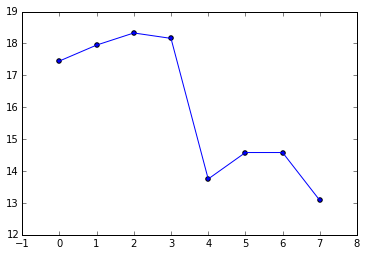
{'0': {'MaxT': 17.45, 'MinT': 2.04},
 '1': {'MaxT': 17.95, 'MinT': 5.84},
 '2': {'MaxT': 18.33, 'MinT': 7.99},
 '3': {'MaxT': 18.16, 'MinT': 7.7},
 '4': {'MaxT': 13.75, 'MinT': 3.62},
 '5': {'MaxT': 14.58, 'MinT': 9.23},
 '6': {'MaxT': 14.58, 'MinT': 9.23},
 '7': {'MaxT': 13.08, 'MinT': -2.99}}
The output above shows the forecasted Max T and Min T values for 0-7 days prior for a specific station at Latitude 40.51218N, Longitude -111.47435E.
Prepare our data for Plotting
The plot will be Max T vs. day out for this one station. It will be a simple plot, but first, we need to make some lists that matplotlib can use to do the plotting. We will need a list of days, and a list of corresponding Max T values:
# First retrieve the days
day_keys  = forecast_dict[('40.51218', '-111.47435')].keys()
day_keys gives you:
['1', '0', '3', '2', '5', '4', '7', '6']
Dictionaries don't necessarily sort alphabetically or numerically, so let's sort them:
day_keys.sort()
returns:
['0', '1', '2', '3', '4', '5', '6', '7']
Matplotlib plots lists of one thing against another. So, let's make our lists:
# First define the variables as lists
day_list = []; maxt_list = []

# Then populate the lists
for day_key in day_keys:
    day_list.append(float(day_key))
    maxt_list.append(float(forecast_dict[('40.51218', '-111.47435')][day_key]['MaxT']))
Now the element in one list corresponds with an element in the other list, for a given element number. For example day_list[0] corresponds to maxt_list[0]
3. Time to Plot! General Scatter Plots
First let's import everything we will need:
%matplotlib inline  # In ipython or ipython notebook only
import matplotlib as mpl
import matplotlib.pyplot as plt
from mpl_toolkits.basemap import Basemap
import numpy as np
Our most simple scatter plot can be made by typing:
plt.scatter(day_list, maxt_list)
# Let's add a line --
plt.plot(day_list, maxt_list)
This gives you:
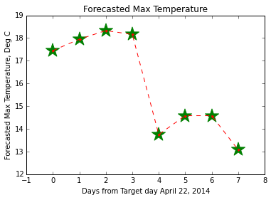
Now let's jazz is up a bit -- Let's Make the lines red and dashed and change the size of the circles, change them to stars and make them green. Also, how is one to know what you just plotted? Let's add the axes labels and the title:
plt.plot(day_list, maxt_list, '.r--')
plt.scatter(day_list, maxt_list, s = 400, color='green', marker='*')
plt.ylabel ('Forecasted Max Temperature, Deg C')
plt.xlabel ('Days from Target day April 22, 2014')
plt.title ('Forecasted Max Temperature')
plt.show()
This will give you:
Click here for more marker fun, and more info on pretty-ing up lines can be found here.
Getting the idea?
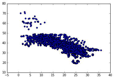
Let's do another plot and this time look at all of the Max Temperature forecasts 2 days out, and plot them with respect to Latitude. We will need to pick out from forecast_dict all the Max T values for all of the weather stations made 2 days before April 22, 2014. First, we will need to get all the Latitudes and Longitudes for each site, then we will need to pick out all the Max T values for each of the stations for that day.
We will keep in mind that maybe in the future you might want to look at Min T, or a different day:
# Get keys of forecast_dict (lats and longs):
keys = forecast_dict.keys()
# Circle through all the keys to get the values for the 2nd day maximum temperature and the
# corresponding Lat and Longs
day_out = '2'       # 0-7
temp = 'MaxT'  # MaxT or MinT
temperature = []; lat = []; lon = []
for key in keys:
    temperature.append(float(forecast_dict[key][day_out][temp]))
    lat.append(float(key[0]))
    lon.append(float(key[1]))
# Now that those are collected, let's see what the Temperature as a function of Latitude is:
plt.scatter(temperature,lat)
This will give you:
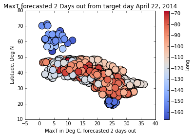
Coloring Points in a Scatter Plot
Let's try again, but this time, color according to Longitude. Again, let's keep in mind we may want to color by something else. You can try playing with these:
color_by = lon
label = 'Long'  # Need to rename if 'color_by' is changed
max_color_by = max(color_by)
min_color_by = min(color_by)

fig, ax = plt.subplots()
s = ax.scatter(temperature, lat,
               c=color_by,
               s=200,
               marker='o',                   # Plot circles
              # alpha = 0.2,
               cmap = plt.cm.coolwarm,       # Color pallete
               vmin = min_color_by,          # Min value
               vmax = max_color_by)          # Max value

cbar = plt.colorbar(mappable = s, ax = ax)   # Mappable 'maps' the values of s to an array of RGB colors defined by a color palette
cbar.set_label(label)
plt.xlabel('{0} in Deg C, forecasted {1} days out'.format(temp,day_out))
plt.ylabel('Latitude, Deg N')
plt.title('{0} forecasted {1} Days out from target day April 22, 2014'.format(temp,day_out))
plt.show()
And now you have color:
Click here for more color mapping fun.
Any ideas what the blue blobs are? (Hint: they are not part of the contiguous United States!)
4. Histograms!
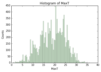
Let's take a step back and work on a histogram. What we are going to plot is the distribution of forecasted temperatures. Let's start with a very simple histogram of the temperature we left off with:
plt.hist(temperature)
plt.ylabel ('Counts')
plt.xlabel(temp)
plt.show()
This gives you a very simple histogram that looks like this:
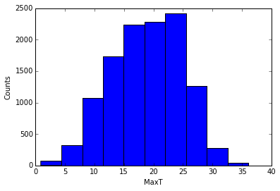
Now let's try again and jazz it up... Let's increase the number of bins (bin size calculated by the difference Min and Max values, divided by the number of bins). Let's also change the color of the bars and make them a little translucent.
Python histograms give you some information about them. Let's explore:
n, bins, patches = plt.hist(temperature, 10, color='green', alpha=0.2)
Note that I've fattened up the bins again for this example... n are the number of counts for each bin:
[ 69., 322., 1078., 1732., 2243., 2285., 2421., 1267., 275., 38.]
bins are the x-centered location of the bins:
[ 0.91 , 4.425, 7.94 , 11.455, 14.97 , 18.485, 22., 25.515, 29.03 , 32.545, 36.06 ]
And patches are a list of the matplotlib rectangle shapes that make the bins.
5. Mapping
Now that we have the basics down, let's start with mapping! We will be using Matplotlib's basemap: http://matplotlib.org/basemap/.
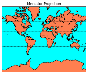
Let's make a simple Mercator Projection Map. The code in the next cell is straight from the Basemap example section -- http://matplotlib.org/basemap/users/merc.html:
# Define the projection, scale, the corners of the map, and the resolution.
m = Basemap(projection='merc',llcrnrlat=-80,urcrnrlat=80,\
            llcrnrlon=-180,urcrnrlon=180,lat_ts=20,resolution='c')
# Draw the coastlines
m.drawcoastlines()
# Color the continents
m.fillcontinents(color='coral',lake_color='aqua')
# draw parallels and meridians.
m.drawparallels(np.arange(-90.,91.,30.))
m.drawmeridians(np.arange(-180.,181.,60.))
# fill in the oceans
m.drawmapboundary(fill_color='aqua')
plt.title("Mercator Projection")
plt.show()
llcrnrlat,llcrnrlon,urcrnrlat,urcrnrlon are the lat/lon values of the lower left and upper right corners of the map. lat_ts is the latitude of true scale. resolution = 'c' means use crude resolution coastlines.
And here is the result:
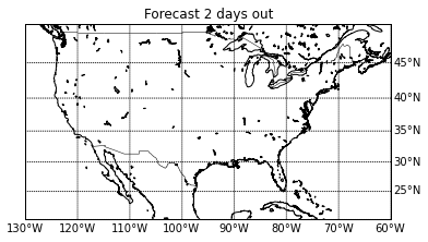
Now let's change this map to do what we need. Let's 1. Change the area to the continental United States 2. Increase the resolution to intermediate ('i') 3. Remove the horrific ocean/land colors provided above:
m = Basemap(projection='merc',llcrnrlat=20,urcrnrlat=50,\
            llcrnrlon=-130,urcrnrlon=-60,lat_ts=20,resolution='i')
m.drawcoastlines()
m.drawcountries()
#m.drawstates()
# draw parallels and meridians.
parallels = np.arange(-90.,91.,5.)
# Label the meridians and parallels
m.drawparallels(parallels,labels=[False,True,True,False])
# Draw Meridians and Labels
meridians = np.arange(-180.,181.,10.)
m.drawmeridians(meridians,labels=[True,False,False,True])
m.drawmapboundary(fill_color='white')
plt.title("Forecast {0} days out".format(day_out))
plt.show()
Now the map looks like this:
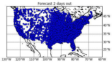
Awesome, now we have the area of our interest -- a map of the contiguous United States. Let's put some data on this map. First, let's just start by putting the points on the map. Here I am just going to make some small changes to the code in the previous code block -- namely, I am going to take the latitudes and longitudes from our dataset and convert them into the map's projection. In this case, it will be converted into the mercator projection I've defined:
m = Basemap(projection='merc',llcrnrlat=20,urcrnrlat=50,\
            llcrnrlon=-130,urcrnrlon=-60,lat_ts=20,resolution='i')
m.drawcoastlines()
m.drawcountries()
# draw parallels and meridians.
parallels = np.arange(-90.,91.,5.)
# Label the meridians and parallels
m.drawparallels(parallels,labels=[False,True,True,False])
# Draw Meridians and Labels
meridians = np.arange(-180.,181.,10.)
m.drawmeridians(meridians,labels=[True,False,False,True])
m.drawmapboundary(fill_color='white')
plt.title("Forecast {0} days out".format(day_out))
x,y = m(lon, lat)                            # This is the step that transforms the data into the map's projection
m.plot(x,y, 'bo', markersize=5)
plt.show()
Now we have a map with the location of the weather stations mapped:
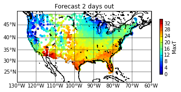
This is nice and all, but it would be great if we can color each of the points by their forecasted maximum temperature -- so let's do that! Here we have to define what points we want to color, and what we want to color them by:
m = Basemap(projection='merc',llcrnrlat=20,urcrnrlat=50,\
            llcrnrlon=-130,urcrnrlon=-60,lat_ts=20,resolution='i')
m.drawcoastlines()
m.drawcountries()
# draw parallels and meridians.
parallels = np.arange(-90.,91.,5.)
# Label the meridians and parallels
m.drawparallels(parallels,labels=[True,False,False,False])
# Draw Meridians and Labels
meridians = np.arange(-180.,181.,10.)
m.drawmeridians(meridians,labels=[True,False,False,True])
m.drawmapboundary(fill_color='white')
plt.title("Forecast {0} days out".format(day_out))
# Define a colormap
jet = plt.cm.get_cmap('jet')
# Transform points into Map's projection
x,y = m(lon, lat)
# Color the transformed points!
sc = plt.scatter(x,y, c=temperature, vmin=0, vmax =35, cmap=jet, s=20, edgecolors='none')
# And let's include that colorbar
cbar = plt.colorbar(sc, shrink = .5)
cbar.set_label(temp)
plt.show()
And finally, now we have a map with colored points:
Interested in playing with this more on your own? Here are a few exercises you can try:
- In the first graph -- include the weather forecast through time for multiple stations. Color each set of lines differently for each weather station. Also color the points differently for each.
- In the second graph -- Try creating a figure with subplots and show the forecasted Max Temperature and forecasted Min Temperature as a function of Latitude side by side.
- In the histogram -- Try overlaying a histogram with of the distribution of Max T values for day 2 with the distribution of Min T values for the same day.
- For the map -- Create a figure with multiple maps, where each map shows the forecasted distribution of temperature for each day out. Change the location of labels.
- What is the difference of the temperature forecast made April 22, 2014 with the previous forecast days? Can you map the differences?
That's it for this workshop! Hope you had fun, and I would love to see what you come up with!
More Info on My Code
Interested in using the notebooks? Check out my Github page which includes the codes, data and instructions on how to use them. Any comments or suggestions are welcome!
Acknowledgements
Thanks to PyLadies Seattle, specifically Erin Shellman and Wendy Grus for organizing this fun little workshop! Also many thanks to Ada Developers Academy for providing the space.
Comments
comments powered by Disqusblogroll
social